Katy Crossley-Frolick, Department of Political Science, Denison University
[For the full report contact: frolickk@denison.edu]
The term “wicked problems” was first introduced into the scholarly lexicon by Rittel and Webber (1973), professors of urban planning and design at the University of California, Berkeley. It refers to the relationship between social problems and the failure of national (e.g. domestic agencies) and international e.g. (the United Nations) institutions to remedy them. It is now widely invoked in a variety of disciplines to describe problems that are seemingly intractable, very resistant or immune to orthodox solutions, and often transnational in scope. Examples of wicked problems include climate change, poverty, proliferation of weapons, migration and displacement, and terrorism.
In my sophomore-level Denison Seminar, students used a web/cloud-based collaborative visualization tool called DebateGraph, to explore, identify, analyze and design possible solutions to wicked problems. DebateGraph is basically a tool for “dialogue mapping” (Conklin 2006). It provides an electronic platform for students to develop a visual picture or map that “captures and connects participants’ comments as a meeting conversation unfolds” (Conklin 2006). I have selected it for two main reasons. First, in my Political Science courses, I often use a variety of visual aids for unpacking complex concepts (e.g., differences between parliamentary, presidential, and semi-presidential systems). It is clear that while some students immediately grasp complex topics via reading, others literally need things “unpacked” in a way that they can see it and identify connections, comparisons, as well as points of divergence or difference. Even if students grasp complex issues with good reading, visualization tools elucidate points in a direct and meaningful way. DebateGraph supports visual forms of learning, and it will also assist the students in developing an online community that they can access outside of class to “visualize, question, and evaluate all of the considerations that any member thinks may be relevant to the topic at hand,” and to encourage “intelligent, constructive dialogue within the community around those issues” (DebateGraph.org). Second, many wicked problems are described as non-linear, defying the linear logic of data collection, data analysis, solution formulation, implementation (Conklin, 2006). DebateGraph provides a mechanism to grapple with non-linearity and, hopefully, make students more comfortable with non-linear methods or opportunity-driven methods of problem solving.
I created four teams of four students, each tasked with the exploration and analysis of a wicked problem that utilizes DebateGraph as part of their research and group deliberations. Students developed individual DebateGraphs for mapping the elements of a wicked problem, as well as a group DebateGraph to weave together various elements of the problem their group was assigned (climate change, human trafficking, terrorism, or HIV/STDs).
One example of a DebateGraph visual representation is from the student group tasked with human trafficking as a wicked problem. By opening the link to DebateGraph, readers can explore and manipulate various formats of visual representations (e.g., graph, tree, page, outline, etc.), levels of conceptual detail, and labeling that are available to students as they construct their analysis of a wicked problem.
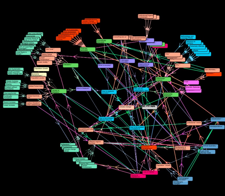
Another example of a wicked problem visualization is for climate change shown below:

Note on the map: The students assigned some kind of “value” or “meaning” to the colors– they represent either the different contributions of different students on a team and/or to signify how concepts/ideas/problems are related. The choice of color is random and the arrows represent the students’ thinking about how the main problem, climate change, is related to other problems. They were asked to consider four issues, indicated by the light blue around “climate change”: 1) how is climate change a symptom of other problems, (2) how is it different from one location to the next, (3) who are the stakeholders, and (4) how would one measure success in combating the problem? This is a representation of how the students, in groups of four, mapped the problems.
After the students in a group produced individual dialogue maps with DebateGraph, each group then produced a final map that was the focus of a research report on “The Anatomy and Physiology of a Wicked Problem.” This group report addressed four inter-related questions that were associated with the group’s dialogue map: How is the wicked problem you investigated different from one location to the next? What measures, metrics or criteria have been developed to measure success in tackling the problem? Who are the stakeholders? How do their perspectives differ? How is the problem a symptom of another?
As part of a formative evaluation of this learning assignment using DebateGraph, I asked students to respond to the following questions:
- Did DebateGraph help you structure the wicked problem your group was assigned? If so, how? If not, what do you think hindered your ability to utilize it in a way that was helpful?
- How did your group use it in constructing the group DebateGraph? Did you collaborate or did one person pull the individual graphs together?
- Did you collaborate with other group members in “real time” with DebateGraph?
- Would you recommend the use of DebateGraph the next go around? If no, why and is there another mind mapping tool you would recommend? If so, please name that software. If yes, why would you recommend that it be used again
Responses suggest that the use of DebateGraph generated mixed results. While I think that it helped students to visually map out the complexity and the seemingly endless interconnectedness of “problem upon problem,” there were some comments about the software (e.g., a slow pace in updating graphs, difficult/not intuitive navigating, and not user friendly for online collaboration in real time). Others commented that they knew of similar software, but it cost money and DebateGraph was free of cost so that was an advantage. Further, because the maps are out in the public domain there are risks that anyone with a DebateGraph account can access the team maps and modify them. This happened in one instance. A user in Australia added to the student group working on terrorism as a wicked problem. While frustrating for the students (on some level), it was also a reminder or useful teaching moment about using open source software and the need to set tighter privacy settings.
In sum, in the next iteration of the class I will consult with an Instructional Technologist for support and to identify other visualization software for use. I also will explicitly devote class time to some of the group work in the construction of the dialogue maps. By doing so, the students will learn how to use the software and apply it to a wicked problem analysis as a type of laboratory experience. I think that will help the groups assigned to analyze the “anatomy and physiology” of a wicked problem congeal better.

Katy Crossley-Frolick, Denison
April 10, 2017
Sources:
Conklin, J. (2006) Dialogue Mapping: Building Shared Understanding of Wicked Problems, West Sussex, UK: John Wiley & Sons.
Rittel, H. and Webber, M. (1973) ‘Dilemmas in A General Theory of Planning,’ Policy Sciences, Vol. 4, No. 2, 155-169.
